
KMF Strong Gym
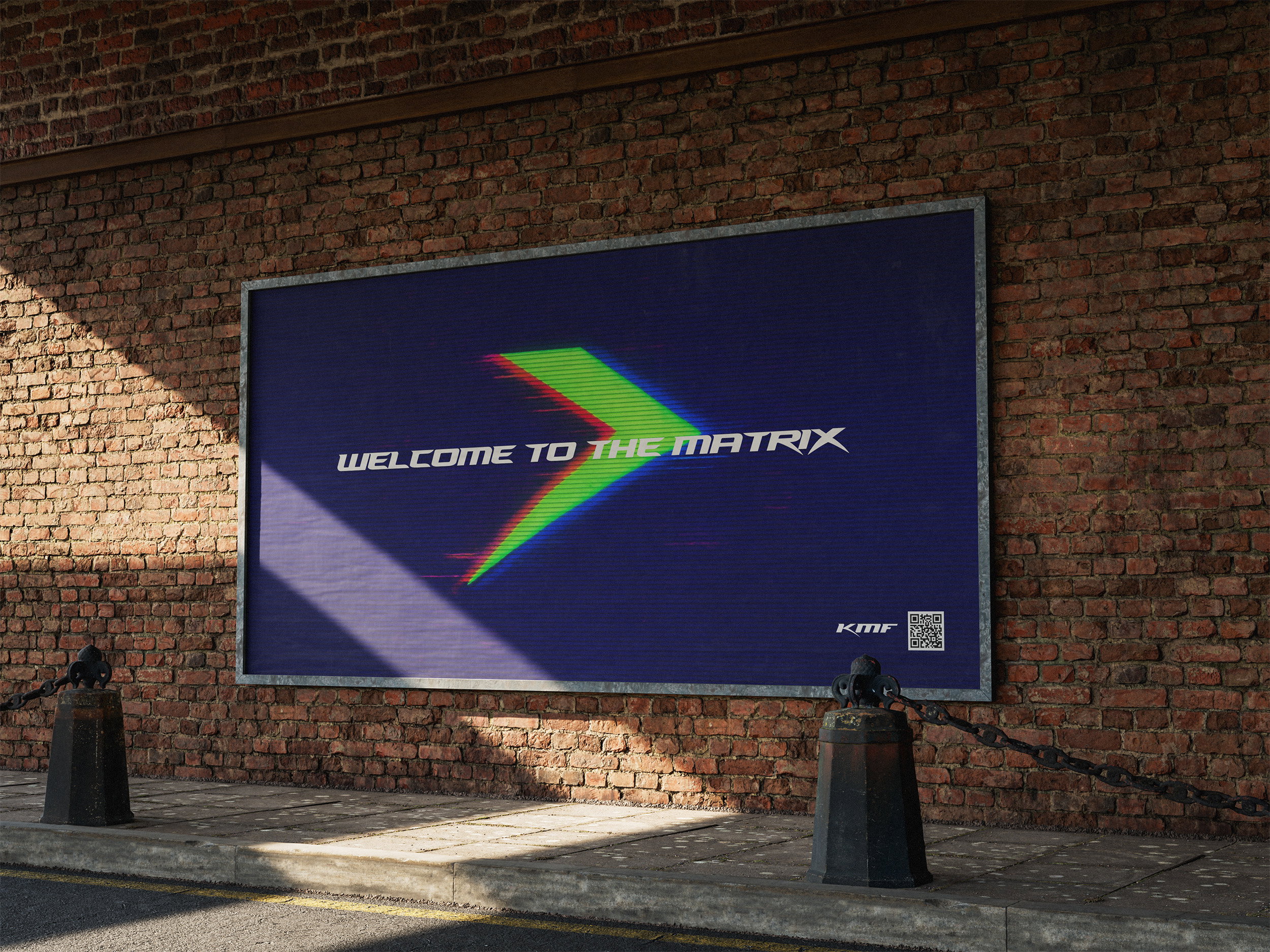
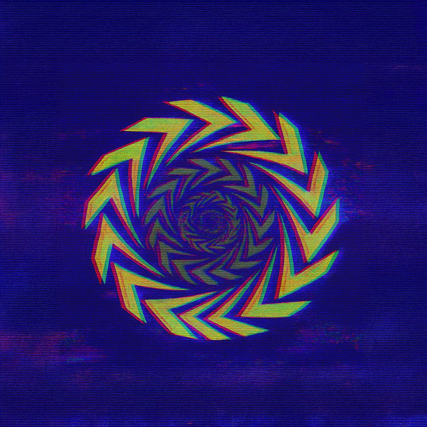
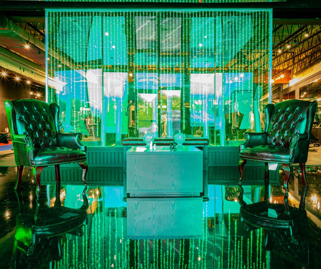
Tired of cookie cutter gyms? Welcome to the matrix.
Summary
KMF Strong was created around a simple idea: progress is a choice. Inspired by the gym's relentless mindset and the concept of choosing your own path, the identity combines bold typography, forward-moving forms, and high-energy visuals to create a brand that feels powerful, modern, and unapologetically driven.
Deliverables
Art Direction
Brand Identity
Packaging Design
Social Media
Type
Client Project
Discovery
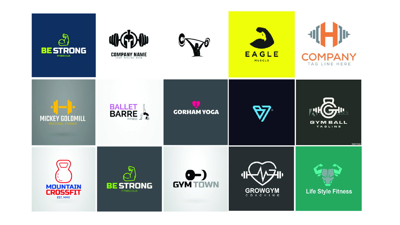
Challenge
Not all gym logos need to have a barbell... Clients specifically requested we break the normal approach to gym branding and make something that expresses how they came to find there love for fitness.
Goal
Use the "Keep Moving Forward" name to make a logo that feels dynamic matrix driven, and versatile.
Building the Identity
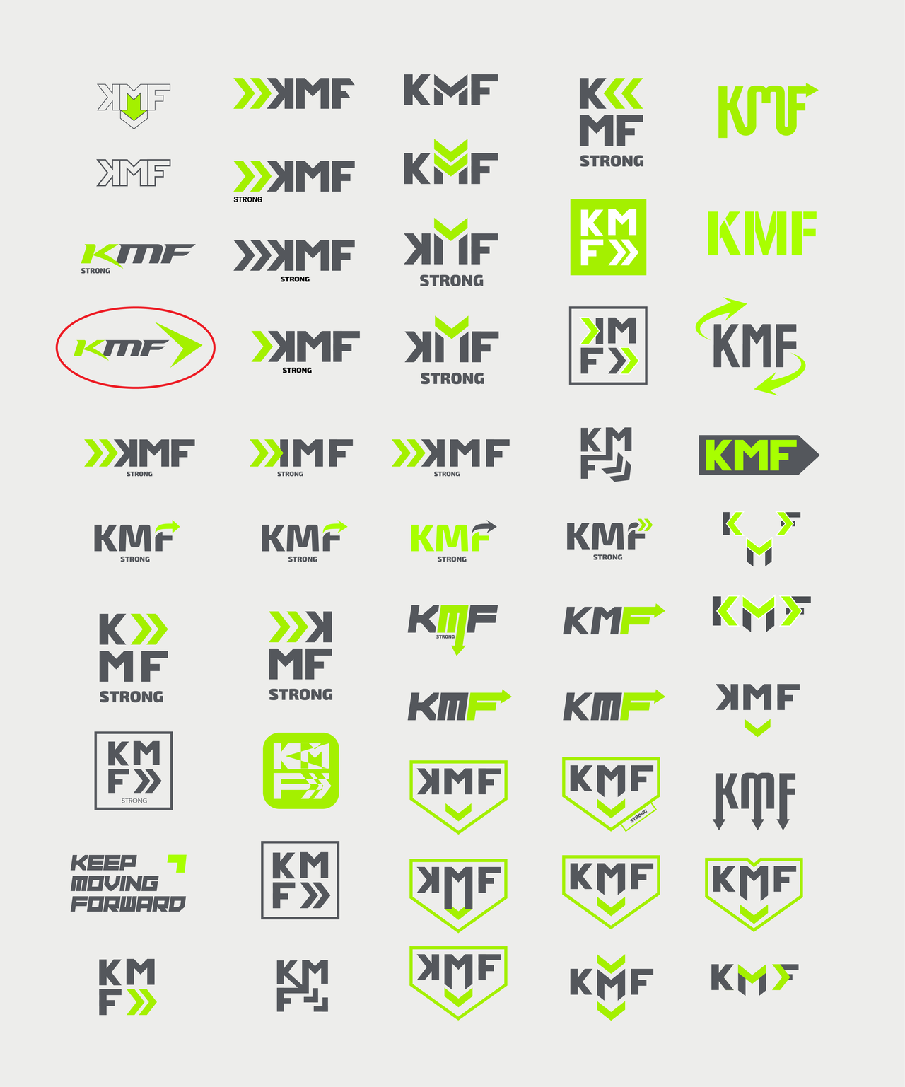
Arrow Ideation
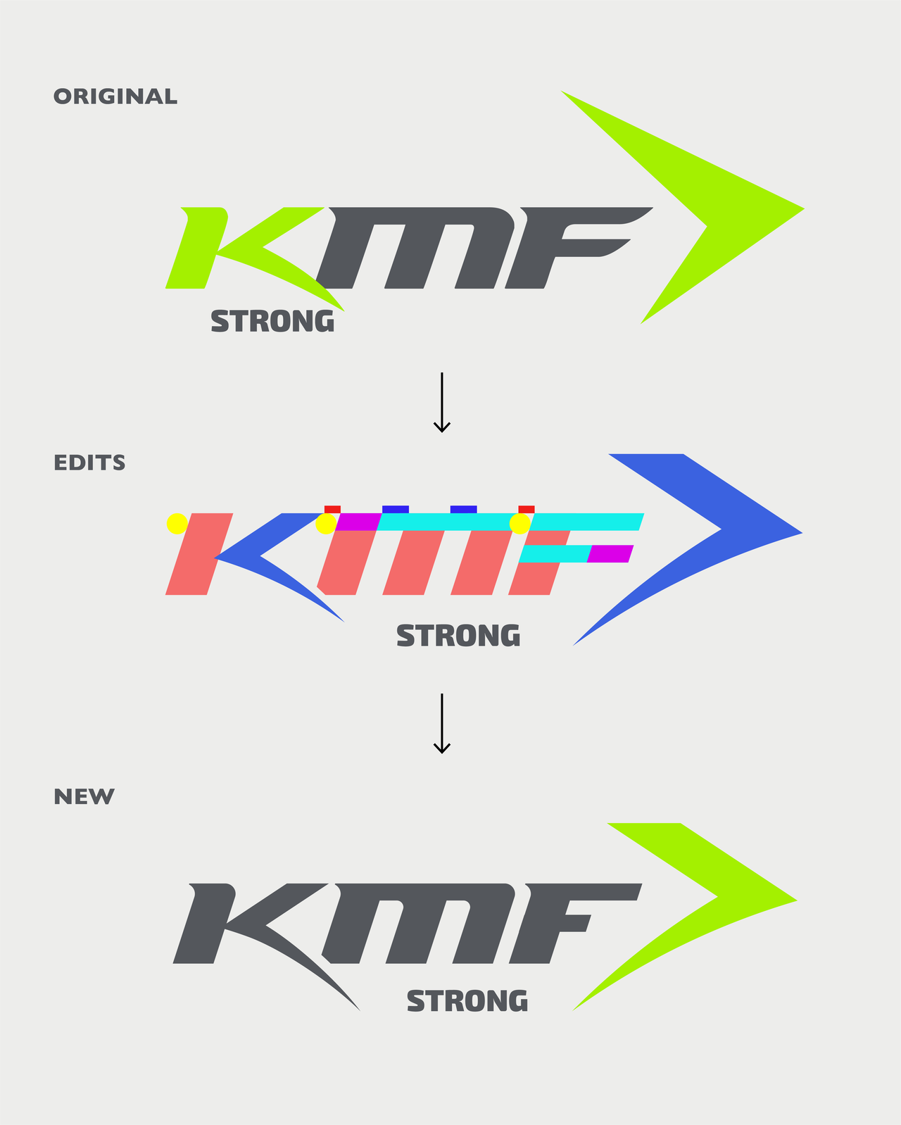
Idea Refinemenet
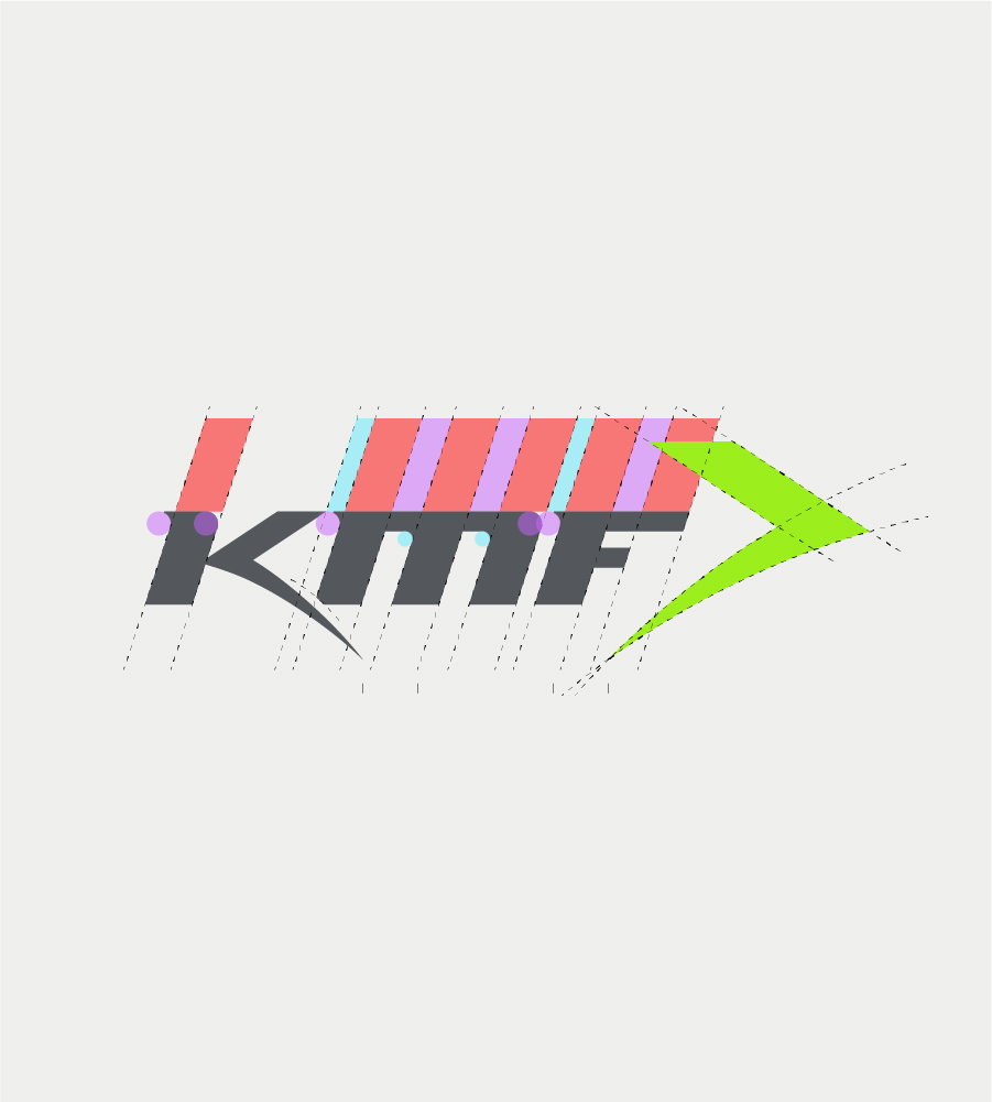
Final Grid
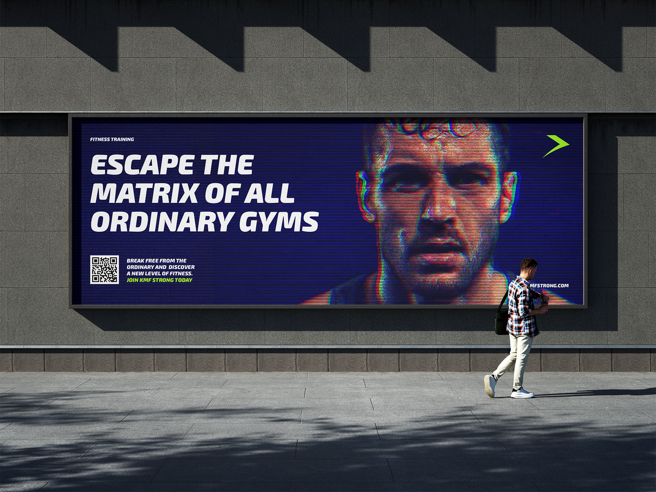
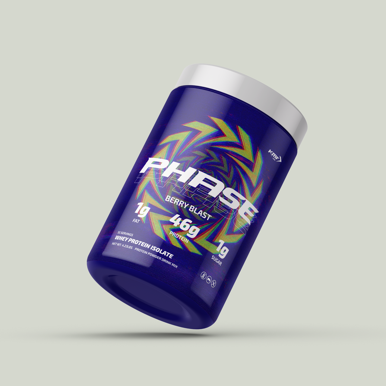
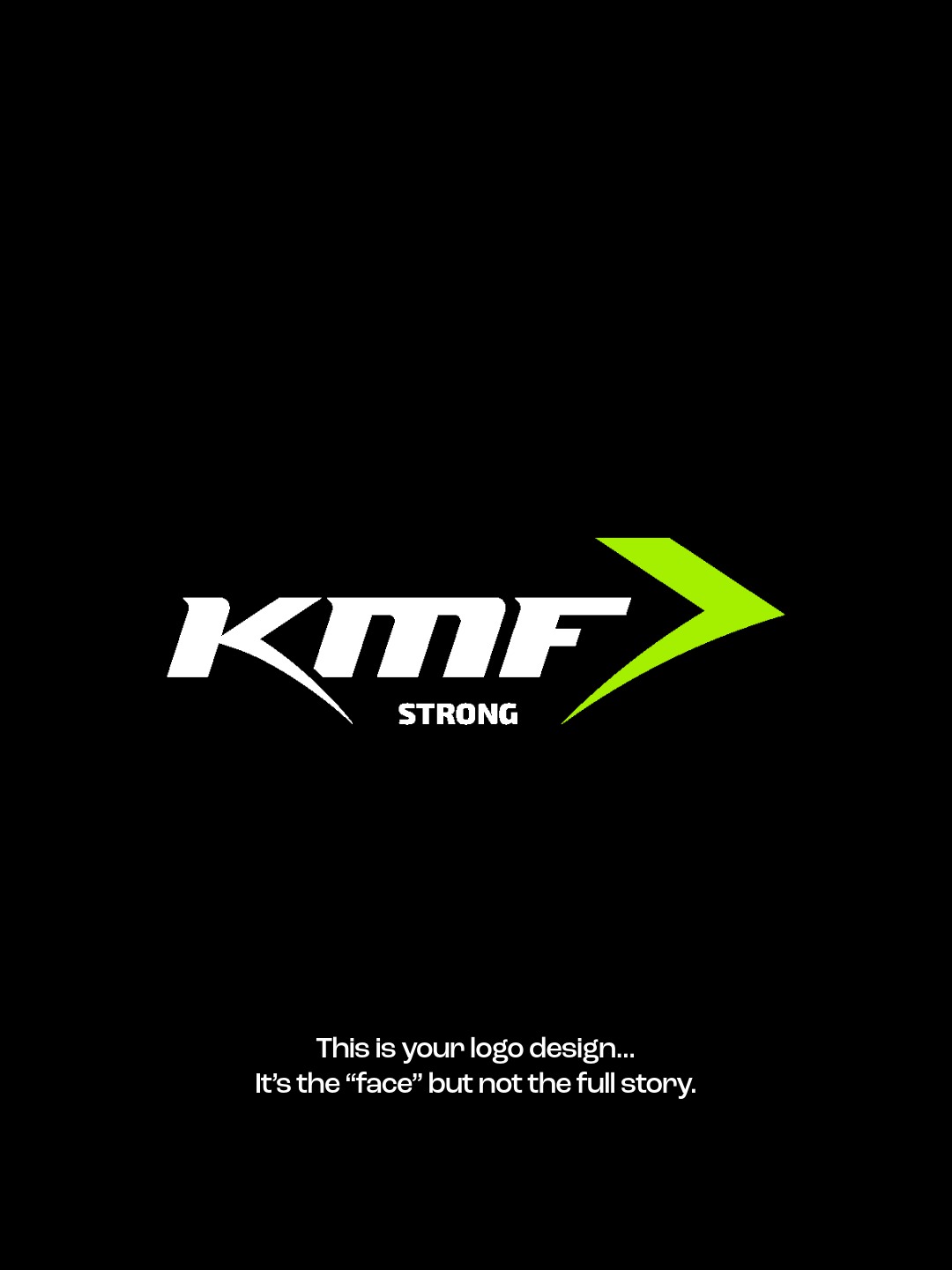
The Logo Says It All
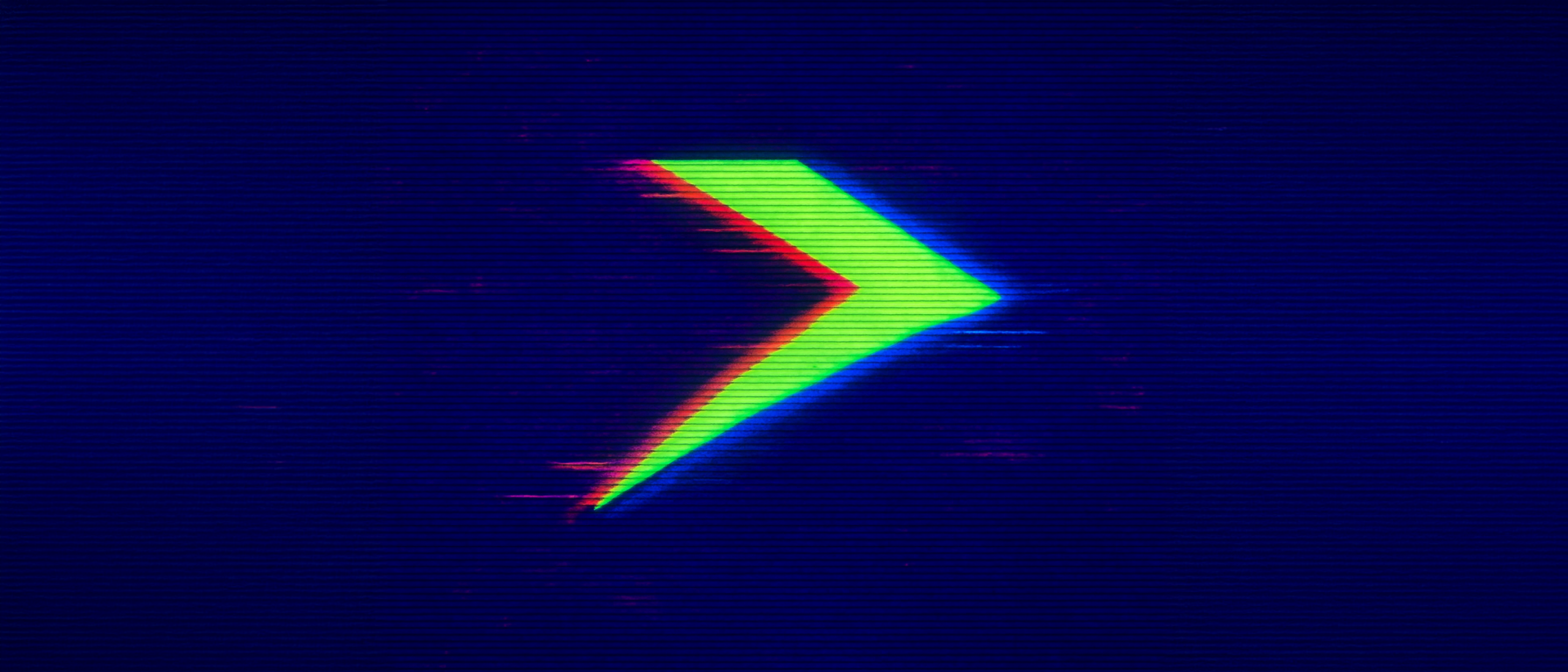
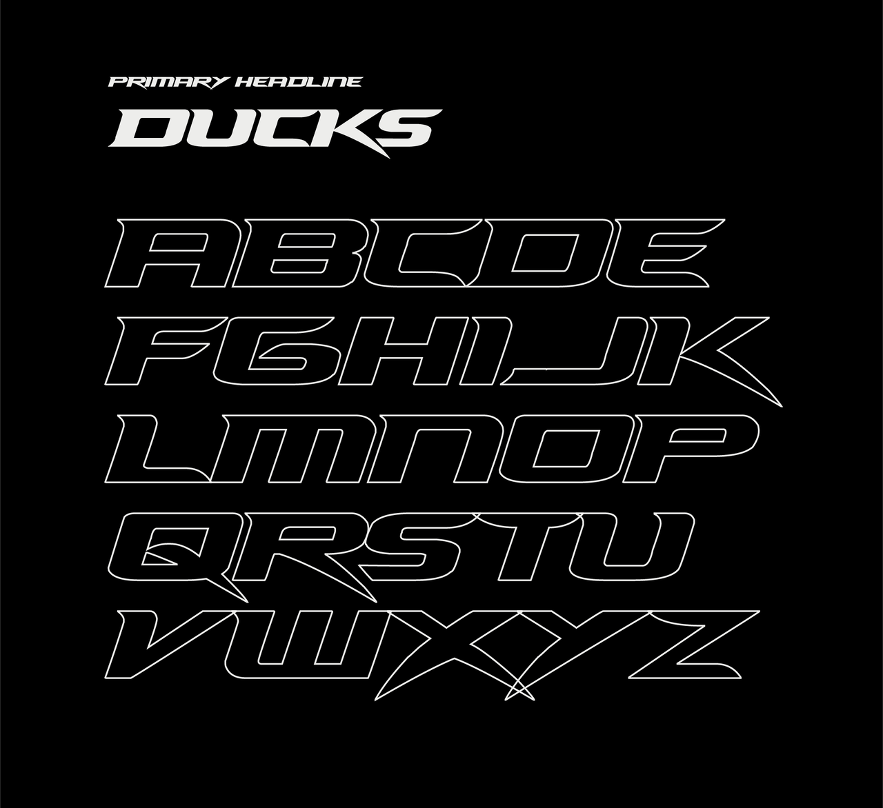
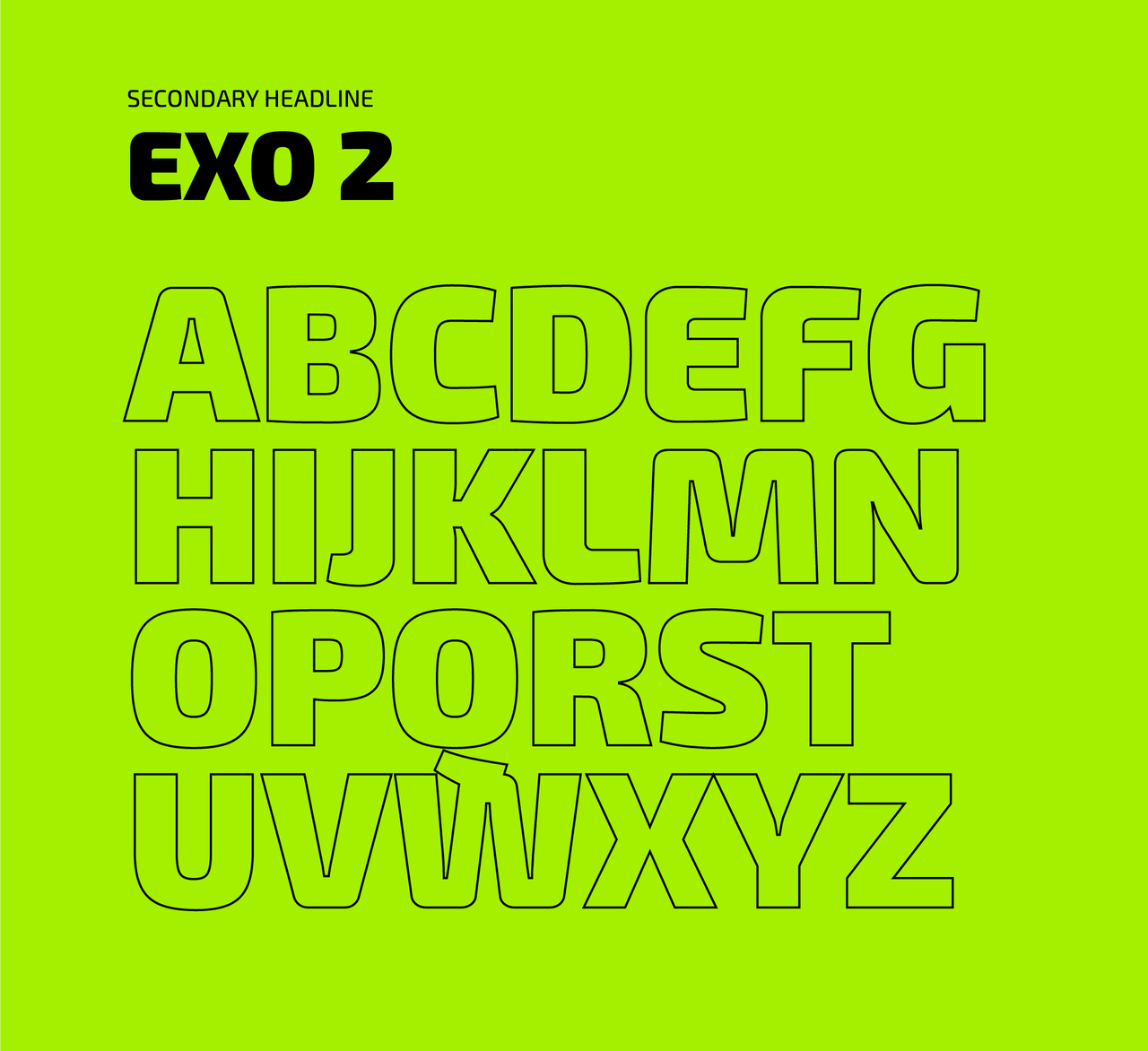
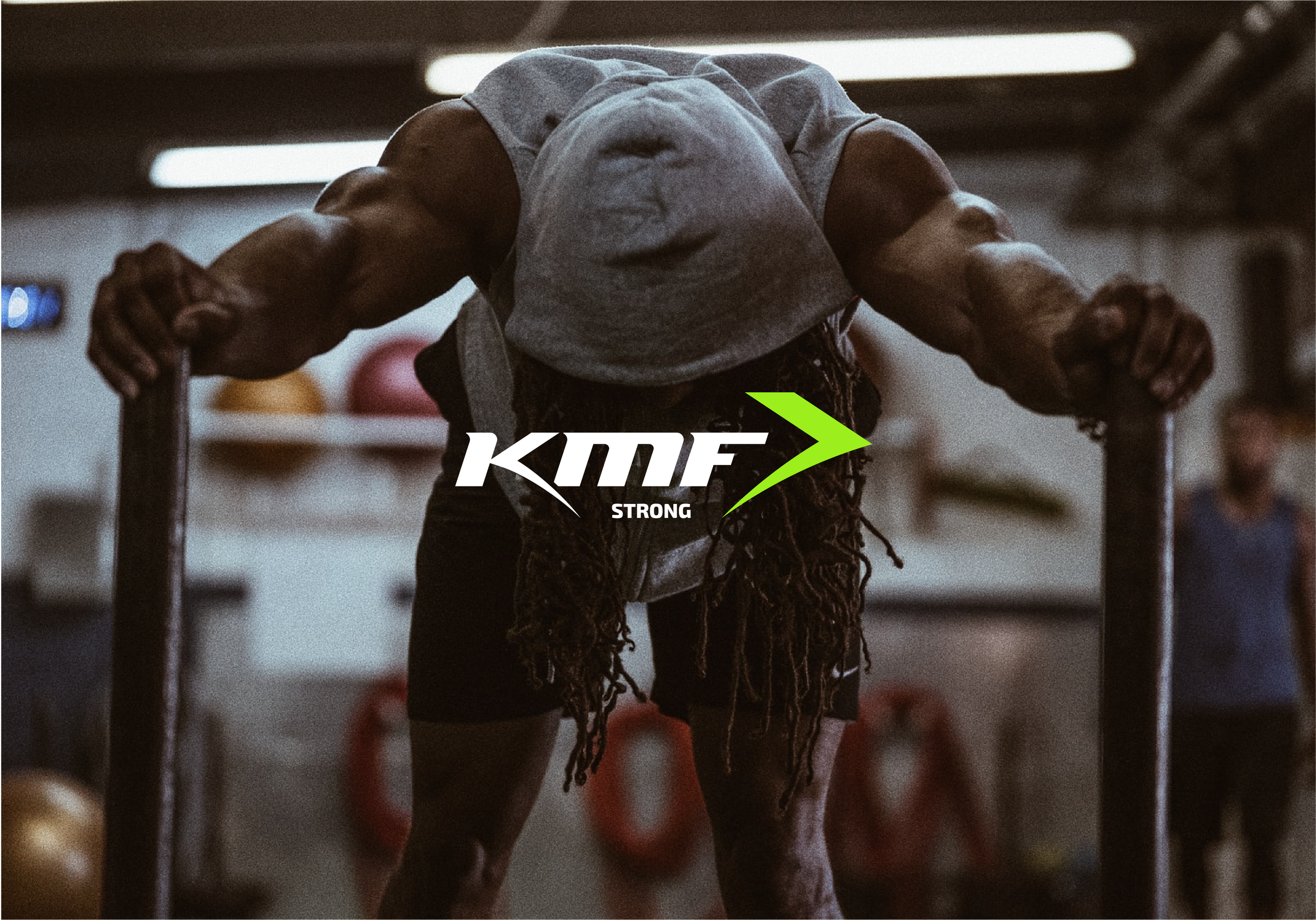
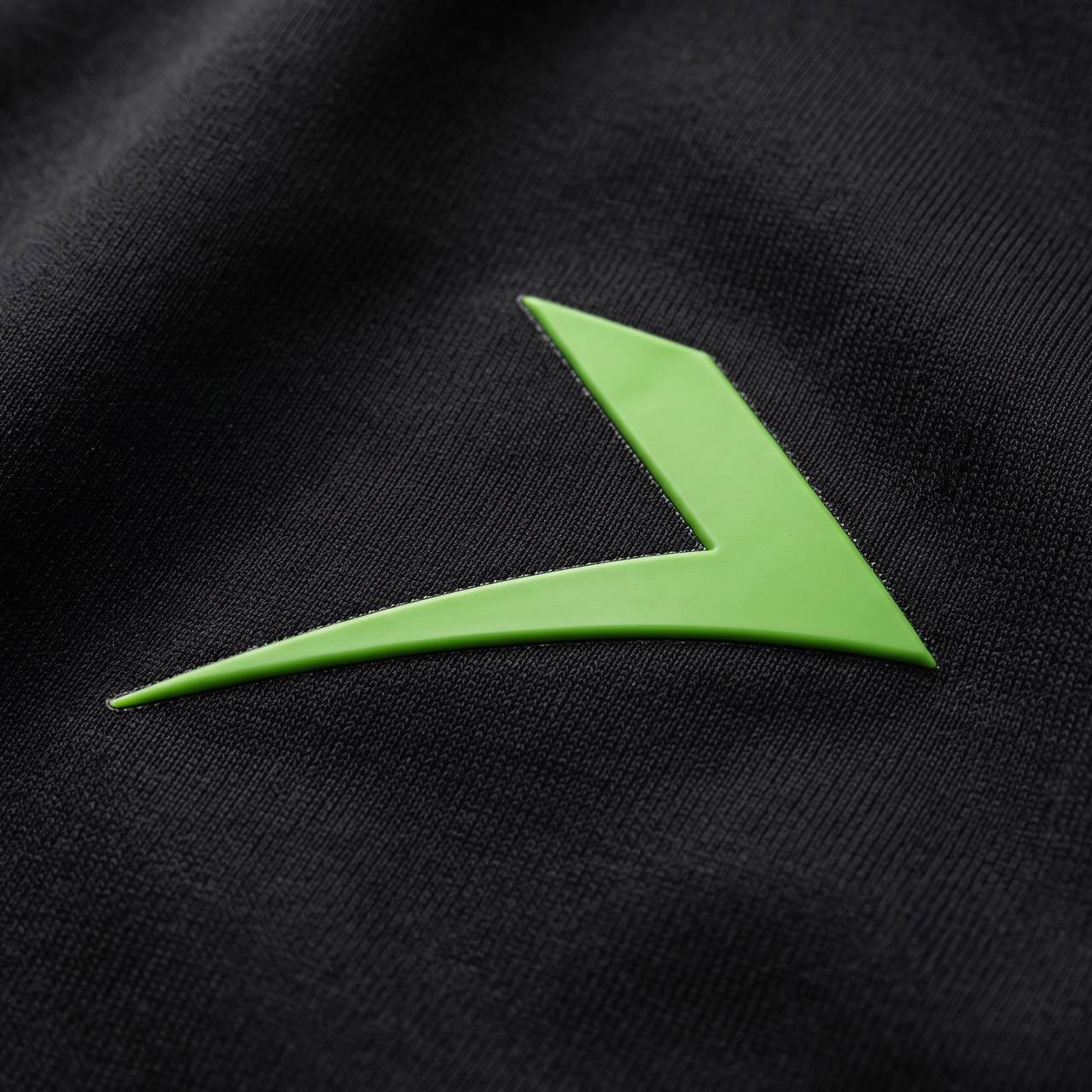
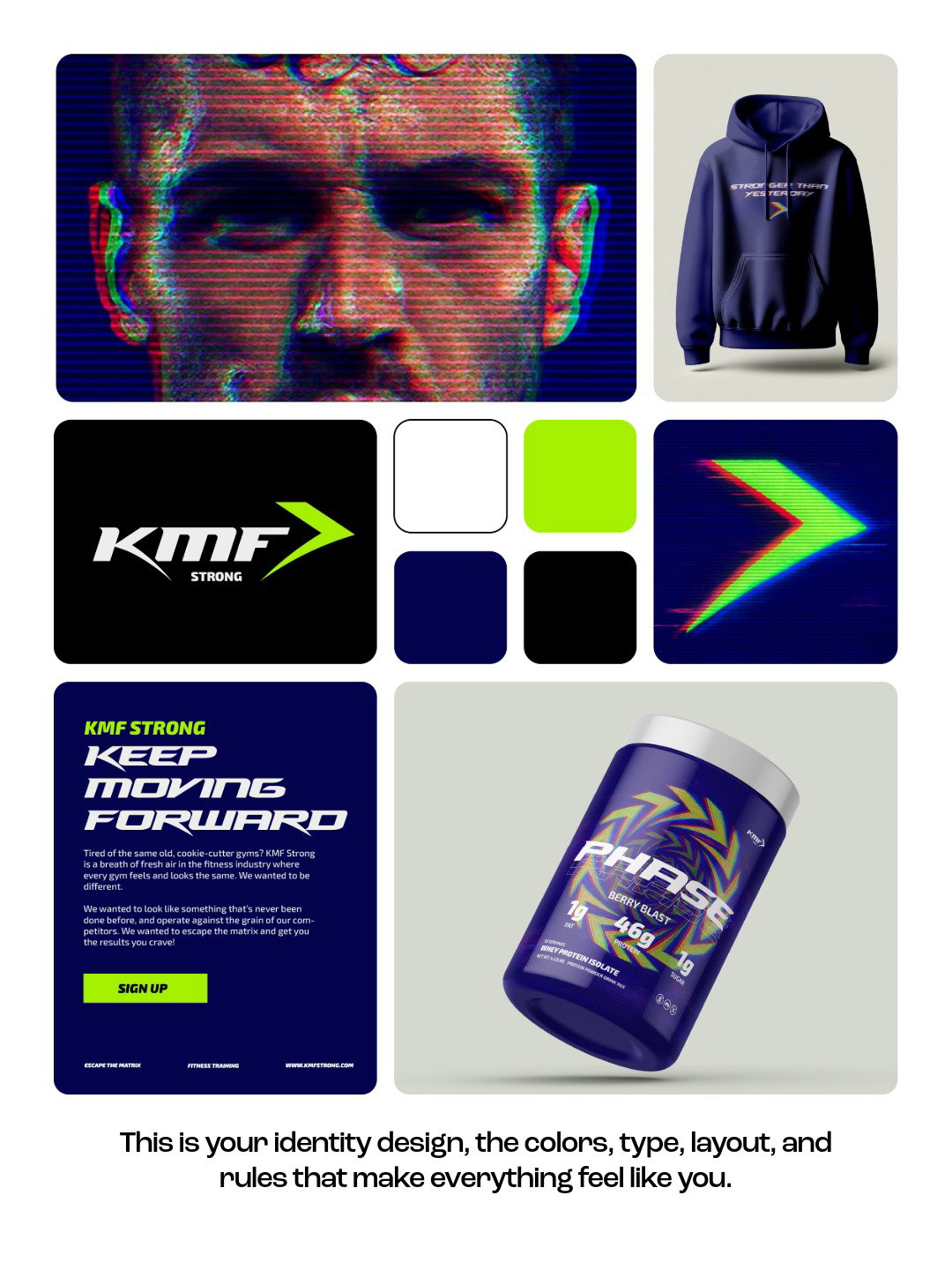
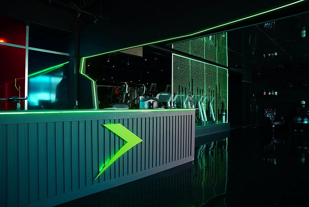
The visual system centers around a custom mark that incorporates forward movement directly into the logo itself. Combined with aggressive typography, energetic graphics, and a bold color palette, we capture the intensity of the KMF Strong community while remaining flexible across apparel, signage, social media, and gym environments.
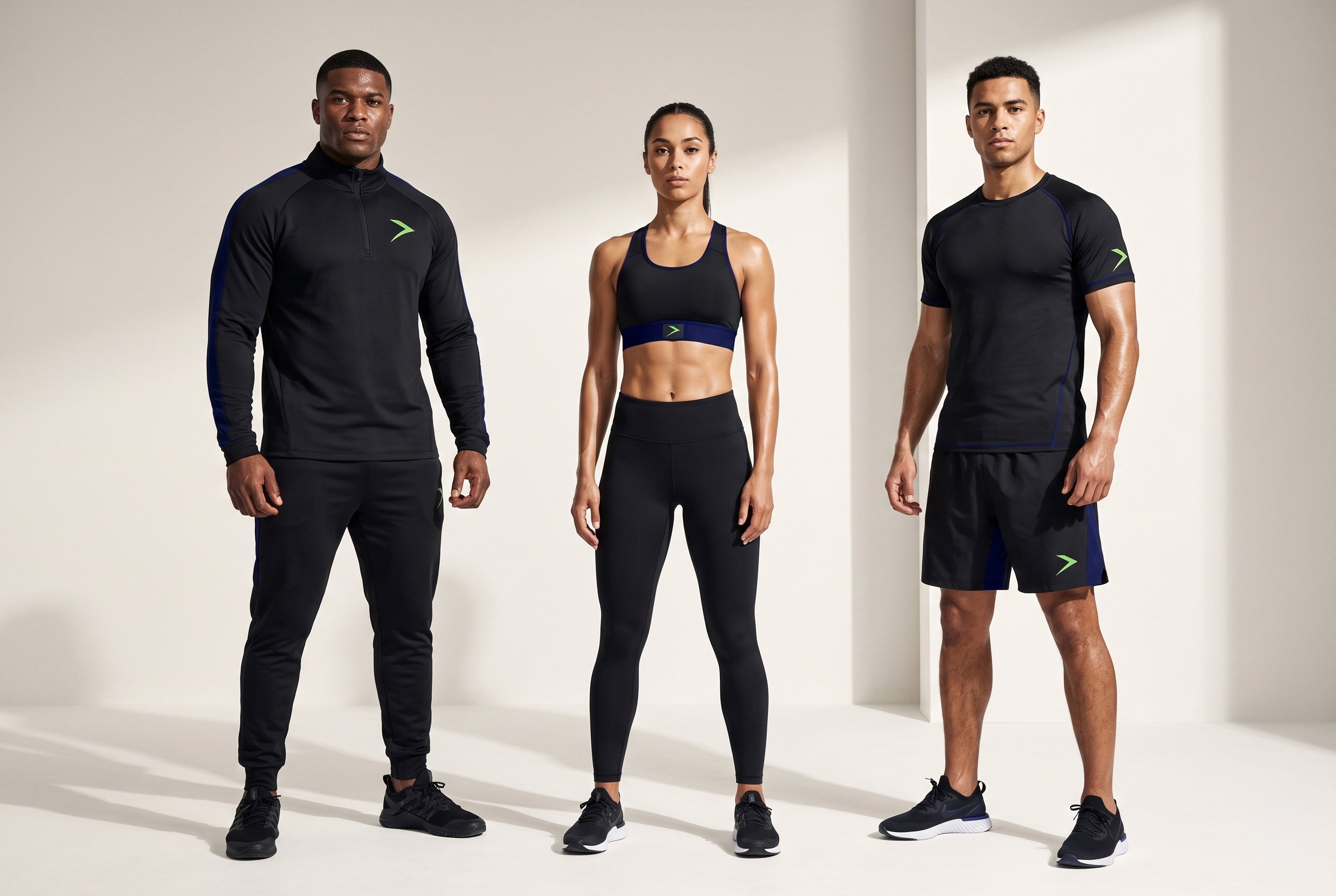

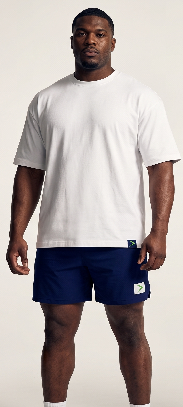
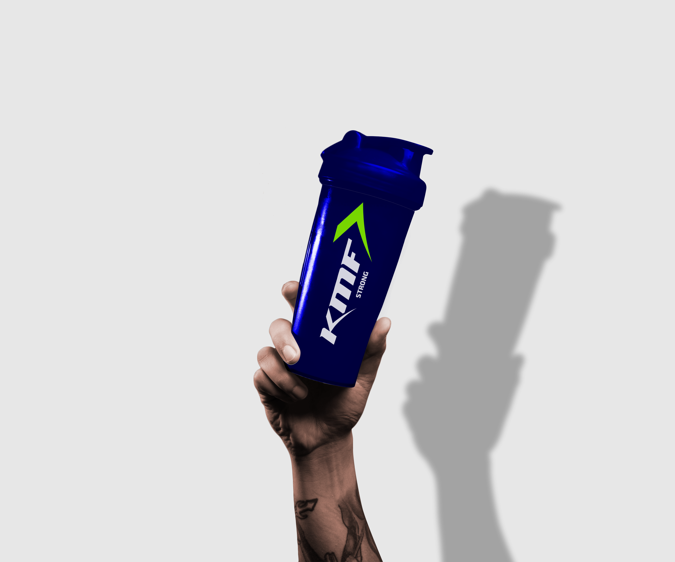
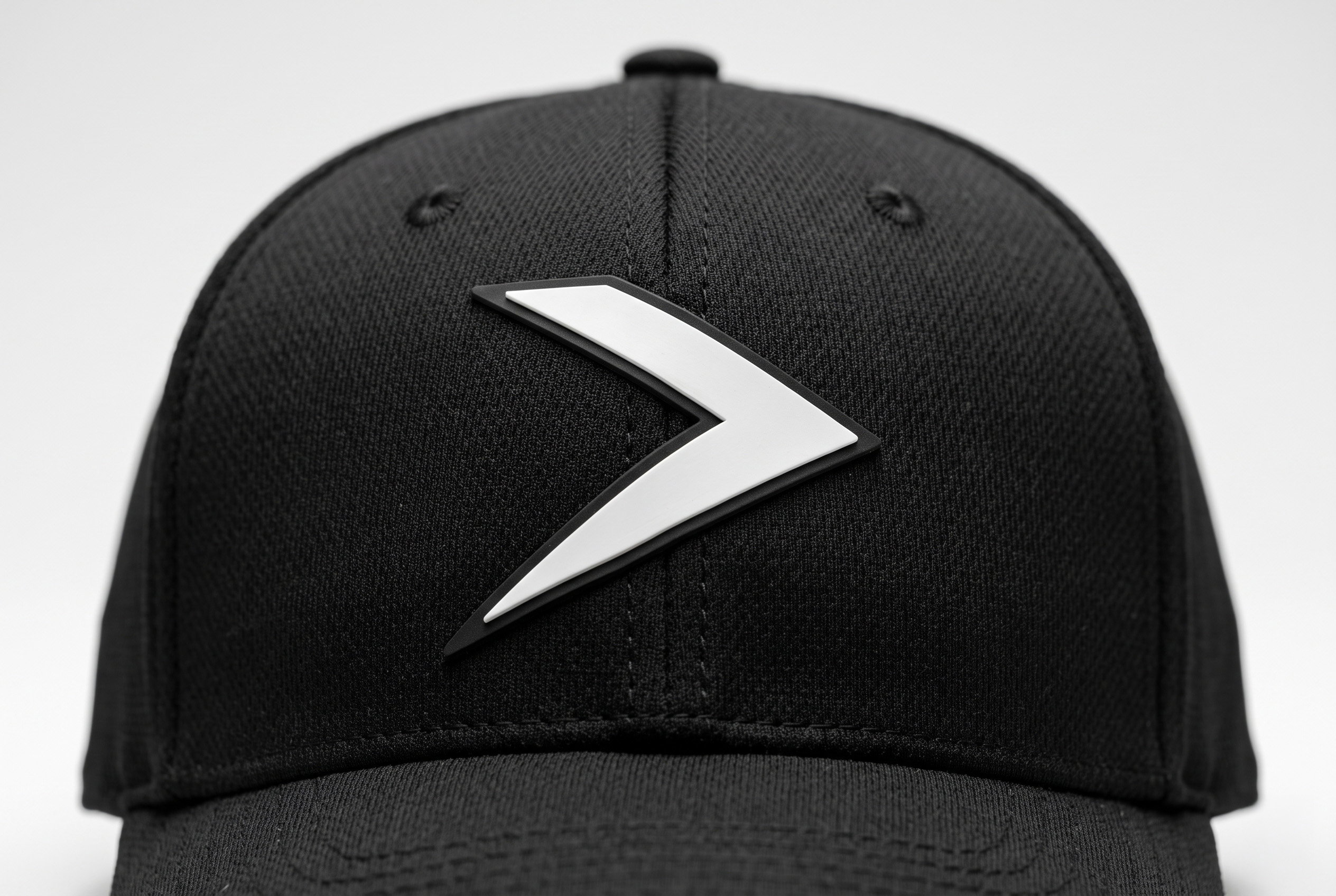
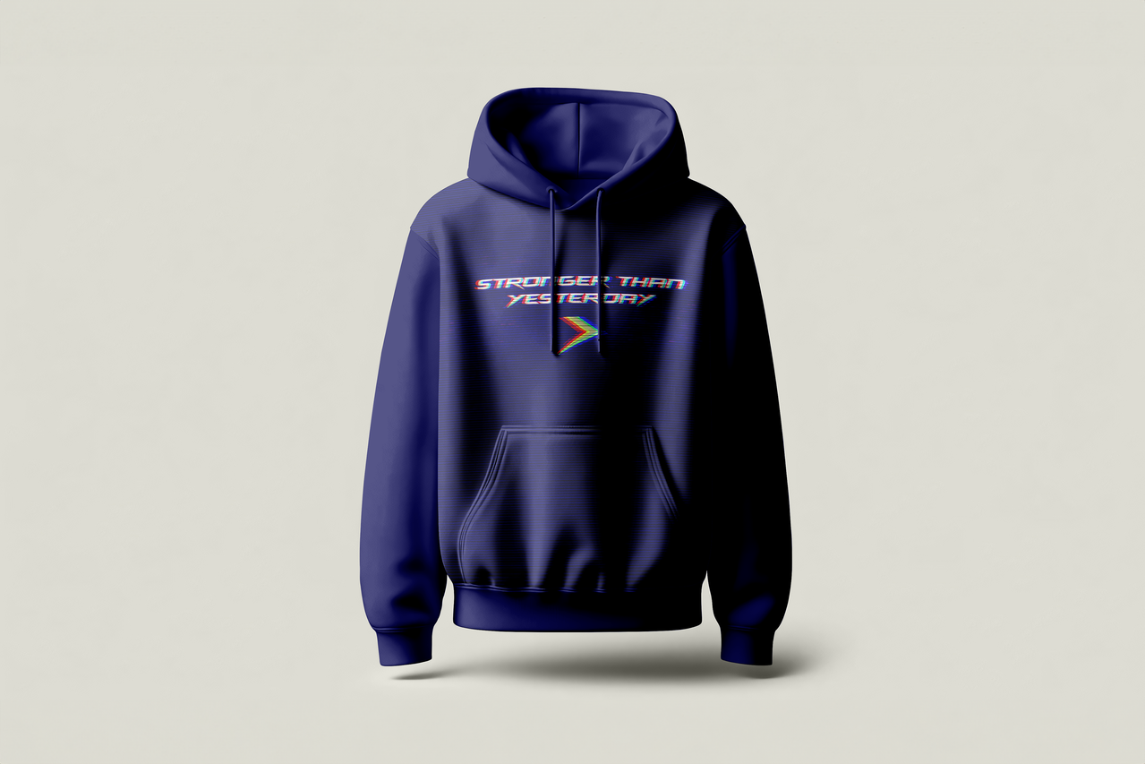
Merch That Members Want To Wear
Gym apparel often feels like an afterthought. For KMF Strong, merchandise was designed around confident messaging and everyday apparel members would be proud to wear both inside and outside the gym.


What It Looks Like Today



TESTIMONIAL
“This was a game-changer for our brand..."
“This was a game-changer for our brand. Joe helps us find our vision of strength and forward momentum and turned it into a logo that feels powerful, modern, and instantly recognizable. Our members love it, and it’s become a core part of how we show up in the community. Couldn’t be happier with the result.”

Kristian, Owner
@kmf_strong
CLIENT
The Brand System
Primary Marks
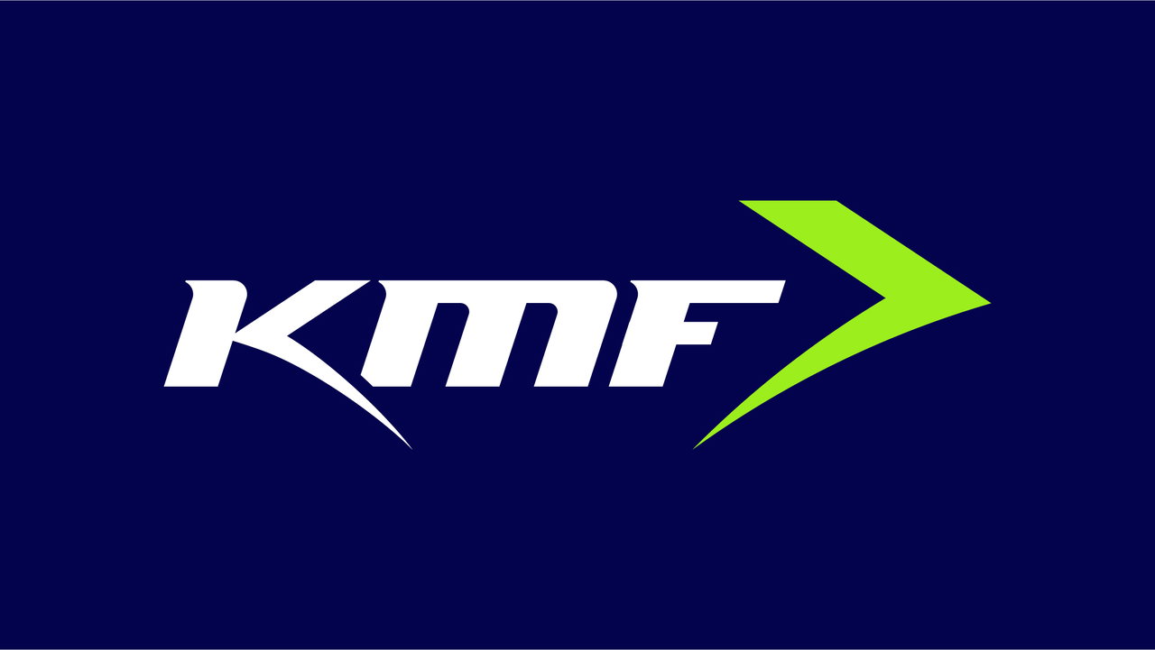
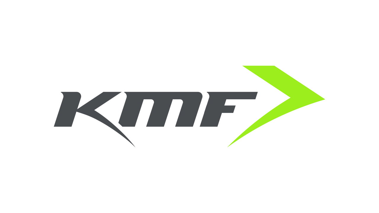
The primary marks were designed to be bold, recognizable, and built for versatility. Centered around the KMF Strong name and custom iconography, the logo system balances strength and simplicity to ensure it performs across every touchpoint.