

Skin Ritual Aesthetic Co.
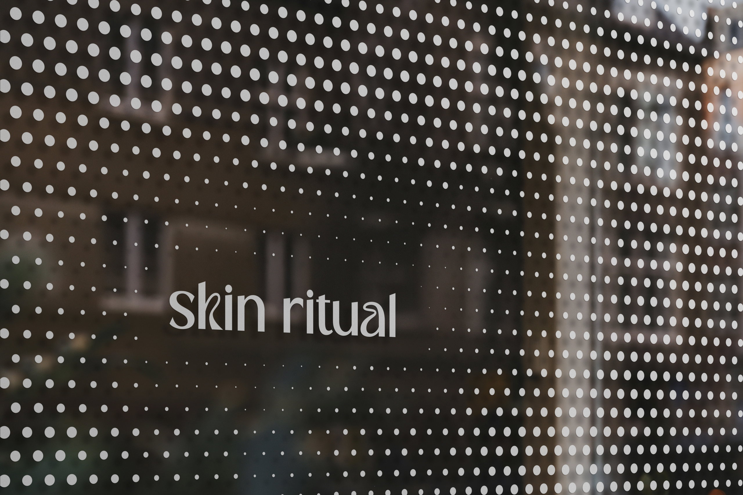
Designing a More Inclusive Skincare Brand
Summary
Skin Ritual is a clinical esthetics studio focused on personalized skincare, expert guidance, and long-term results. The project challenged industry norms by moving away from the hyper-feminine, wellness-driven aesthetics commonly found in skincare branding and replacing them with a modern, gender-neutral identity.
Deliverables
Brand Identity
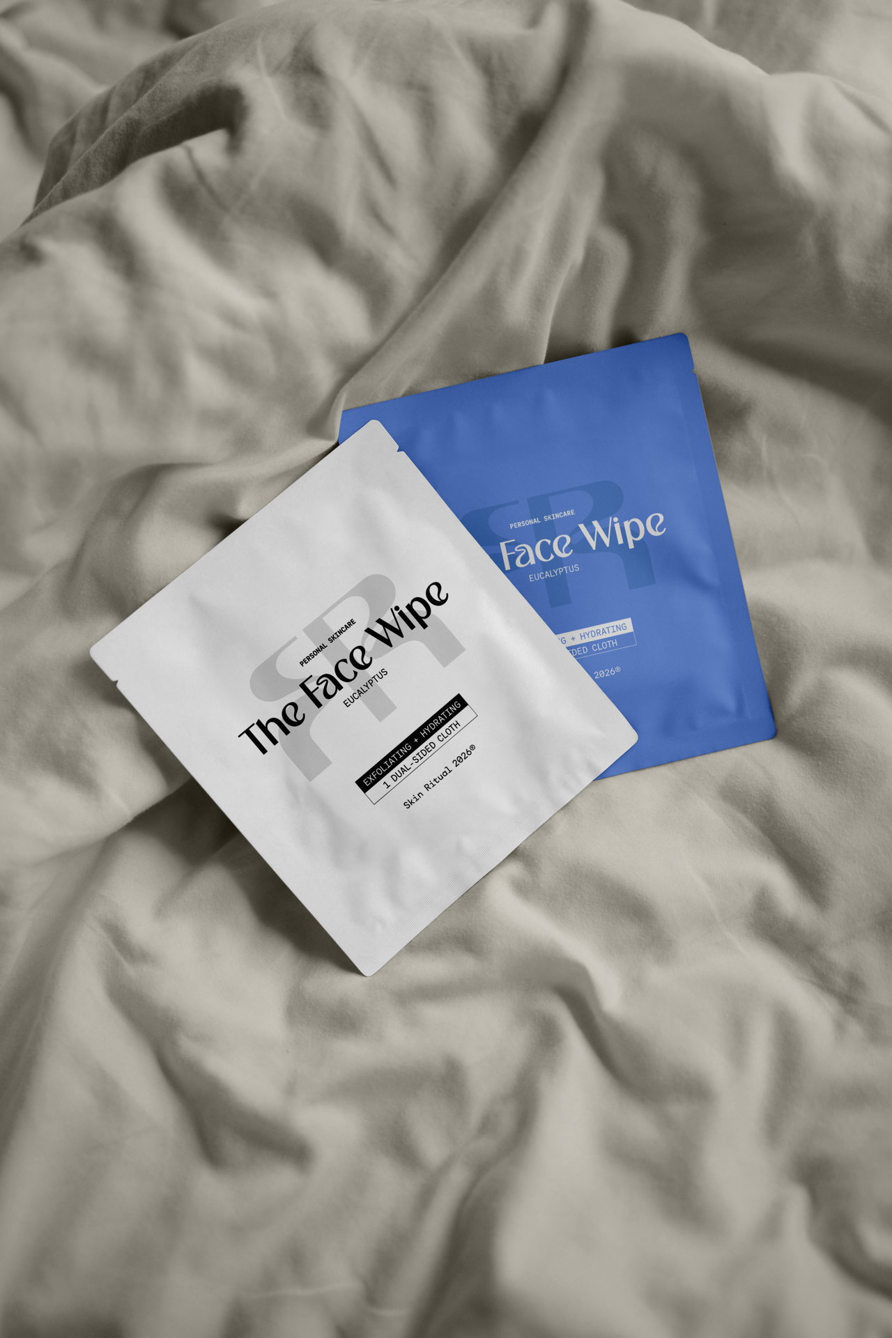
Packaging Design
Social Media
Type
Client Project
Structure & Contrast
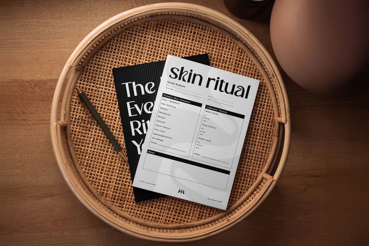
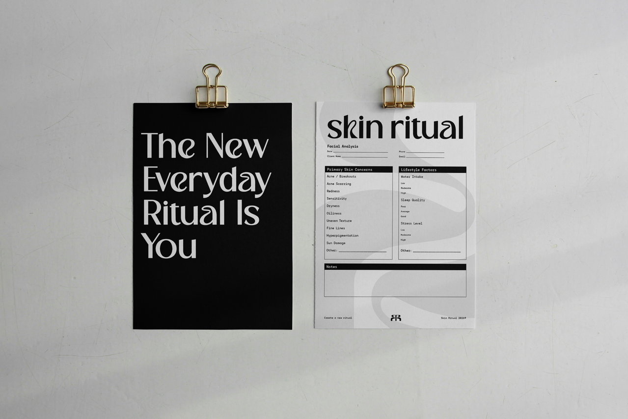
Bold black headers, defined borders, and consistent layouts create a sense of order, professionalism, and neutrality. This contrast allows the softer, organic elements of the identity to stand out while reinforcing Skin Ritual's position as a modern, gender-neutral skincare practice.
Discovery
Challenge
Create an esthetics brand that feels modern, clinical, and welcoming without relying on the hyper-feminine visuals commonly found throughout the industry.
Goal
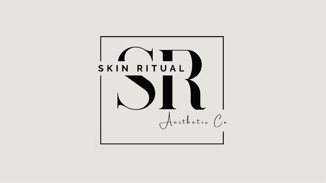
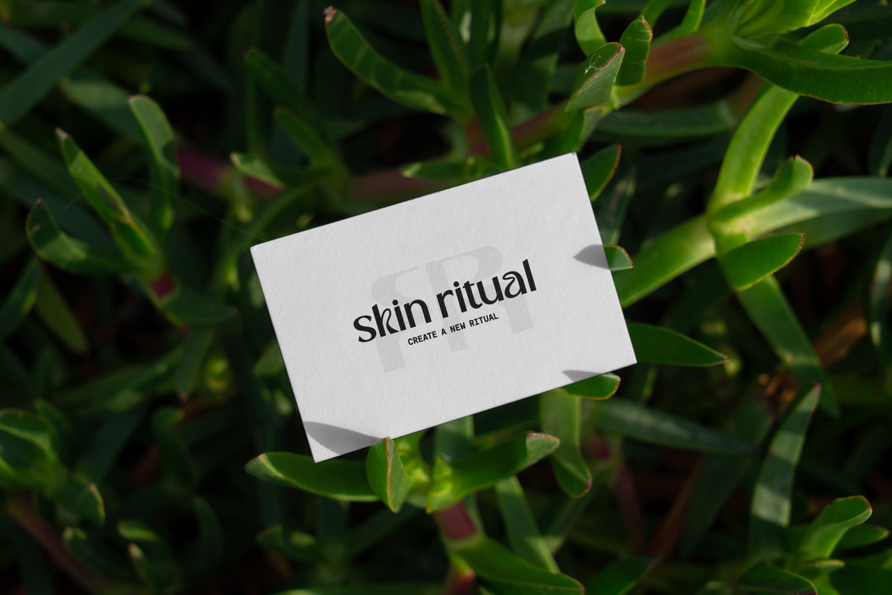
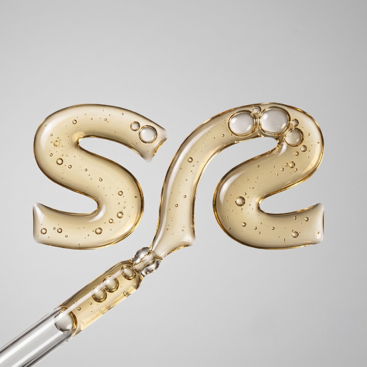
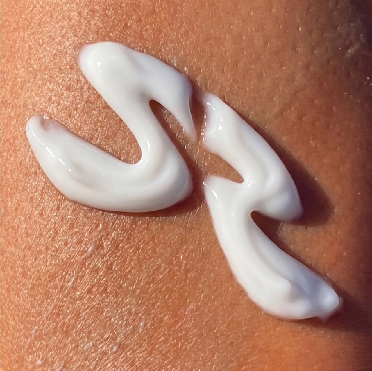
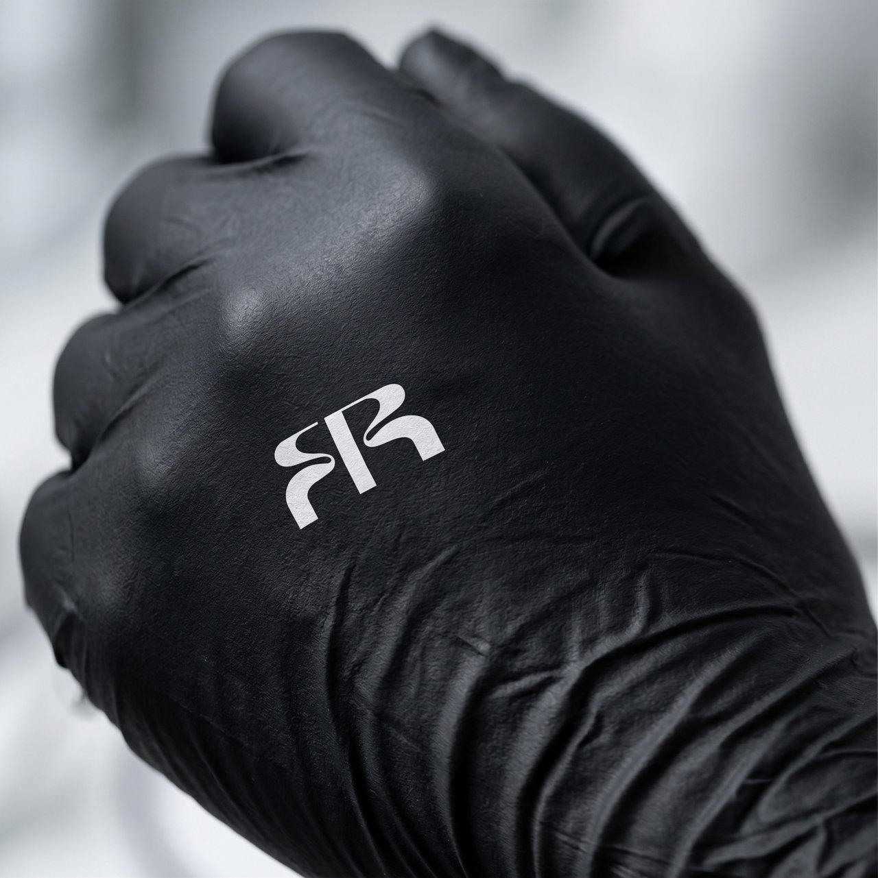
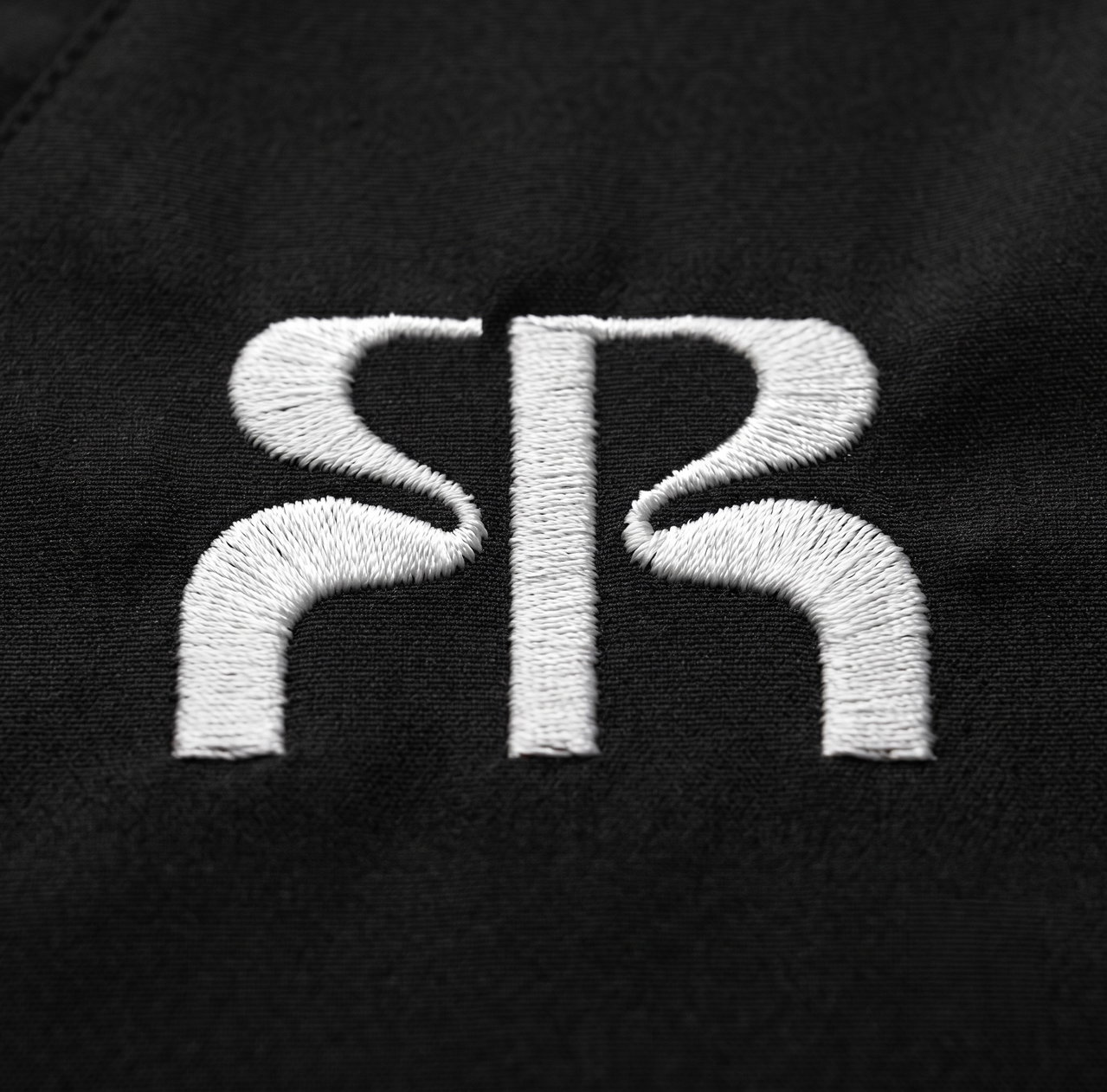
Create a distinctive logo system centered around an SR monogram that feels abstract, memorable, and ownable. The mark needed to move beyond a literal letter combination while subtly reflecting the ideas of ritual, consistency, and personalized skincare.
Building the Identity
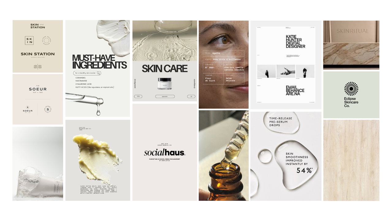
Option 1: Clinical Minimal
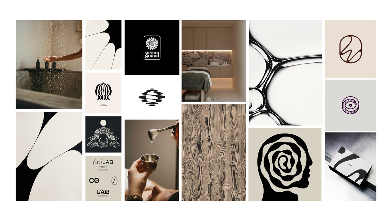
Option 2: Lean Into Ritual
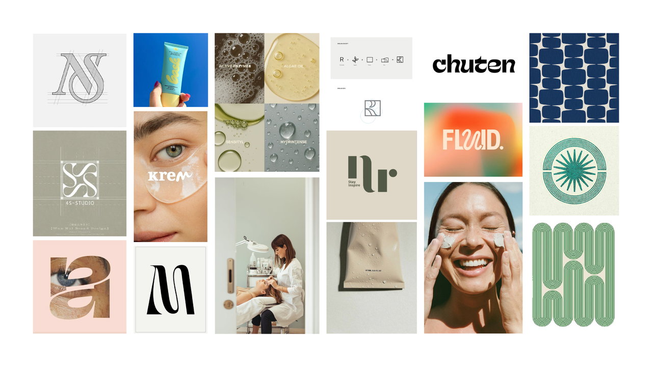
Option 3: Custom Type/Color Pop
Approved Direction
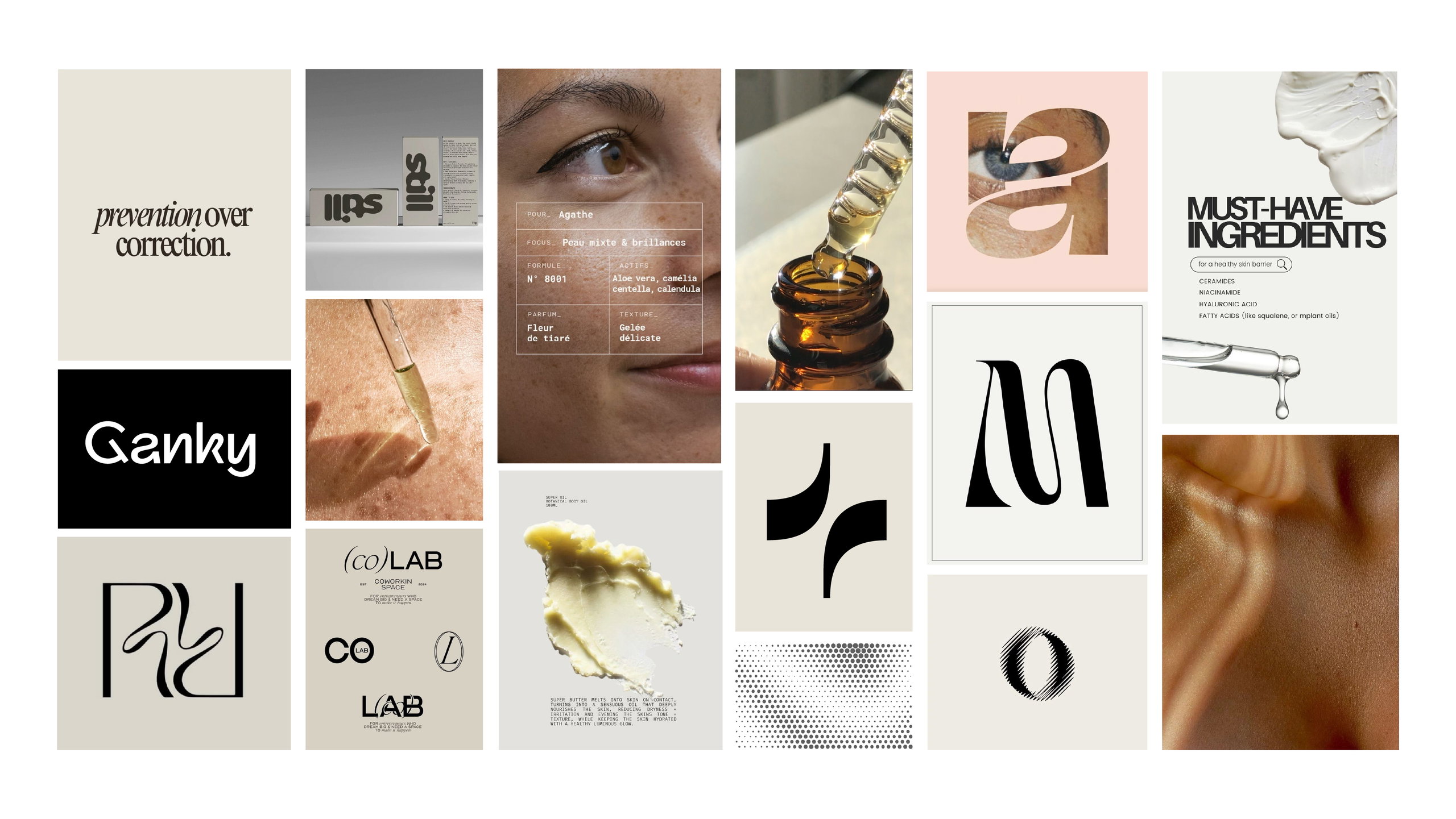
The final direction combines the clarity and trust of a clinical aesthetic with the personality and memorability of custom typography. Clean layouts, generous spacing, and a restrained color palette establish a sense of professionalism and expertise, while the custom wordmark introduces a unique visual signature that sets Skin Ritual apart from traditional esthetics brands.
Ideation

Inspired By Skin Itself
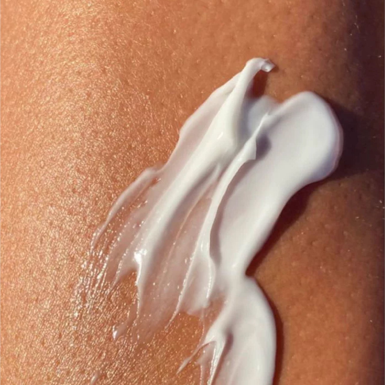
Rather than looking to existing skincare brands for inspiration, the identity was developed from the materials and experiences surrounding skincare itself. The fluid shapes of moisturizer and solutions across the skin informed the logo's organic exploration, while other designs were based on sunlight passing over the body's natural contours. These references became the foundation for a visual language that feels unique, intentional, and connected to the practice of skincare.
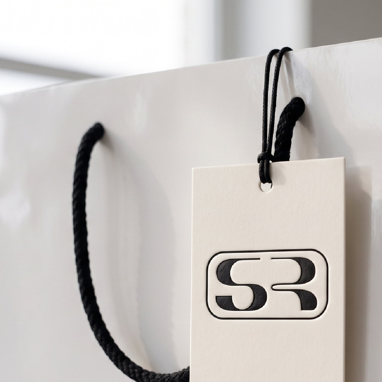
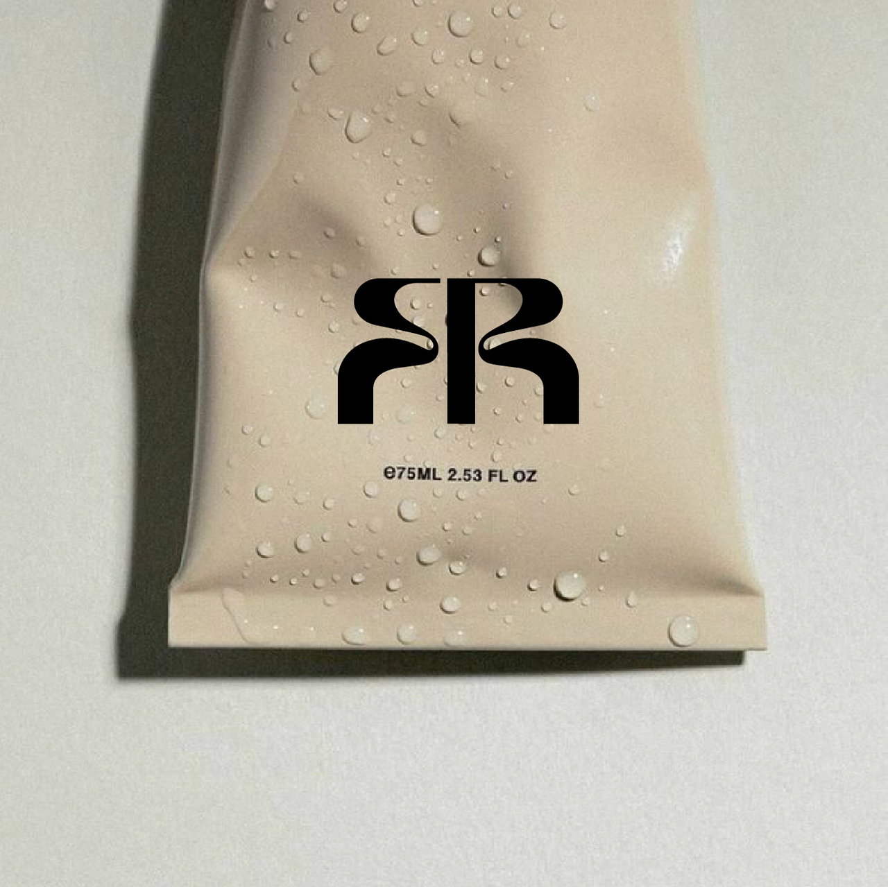
Applying The Identity
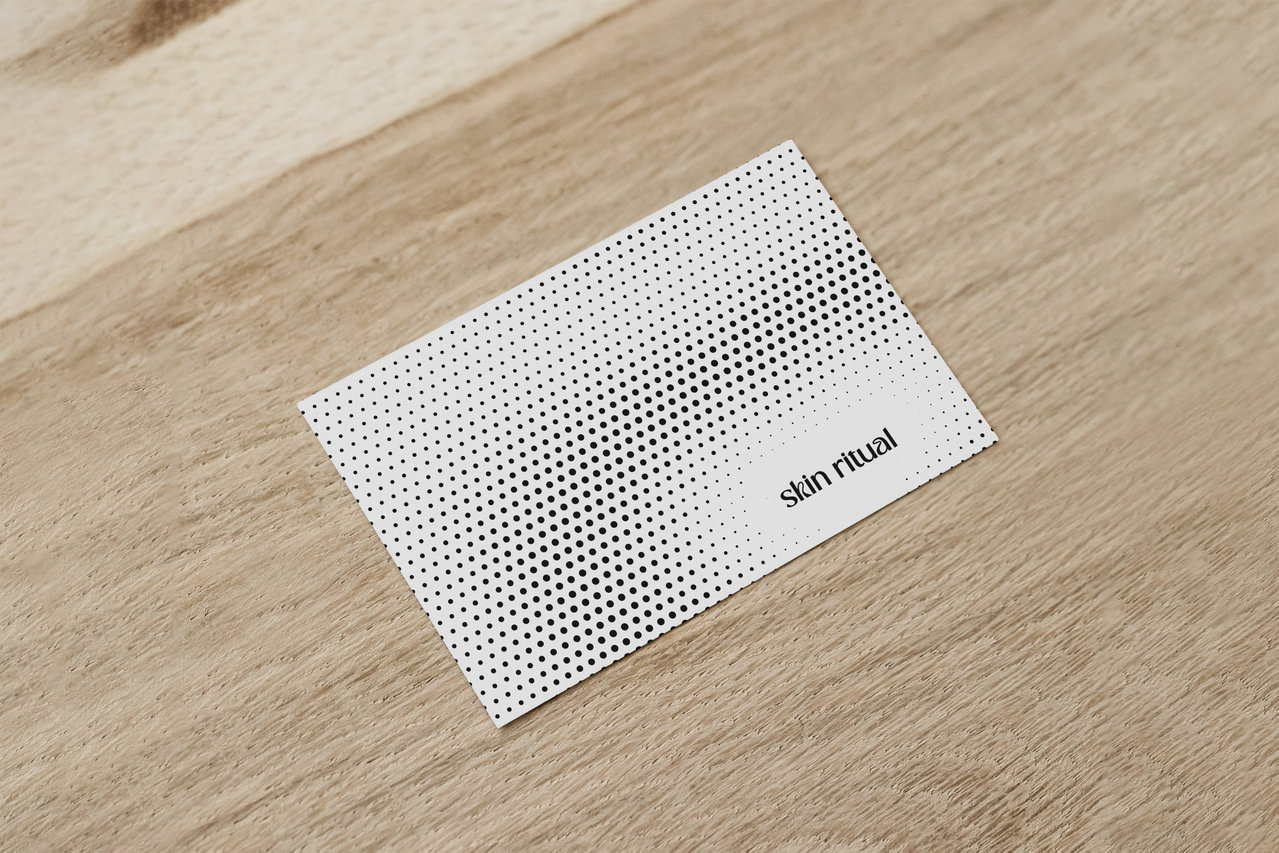
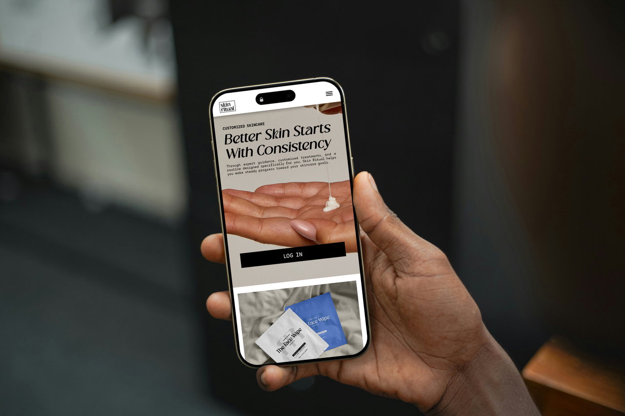
The Brand System
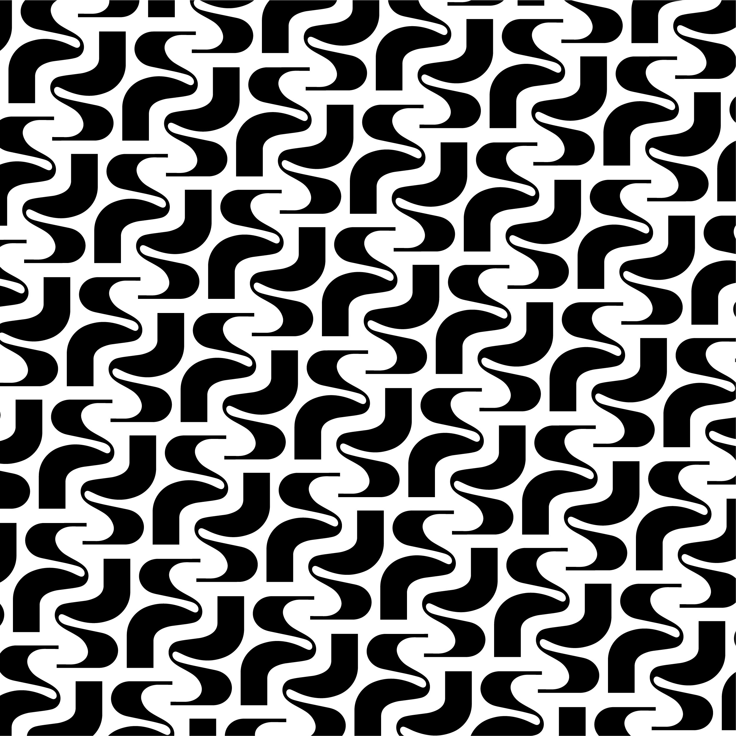

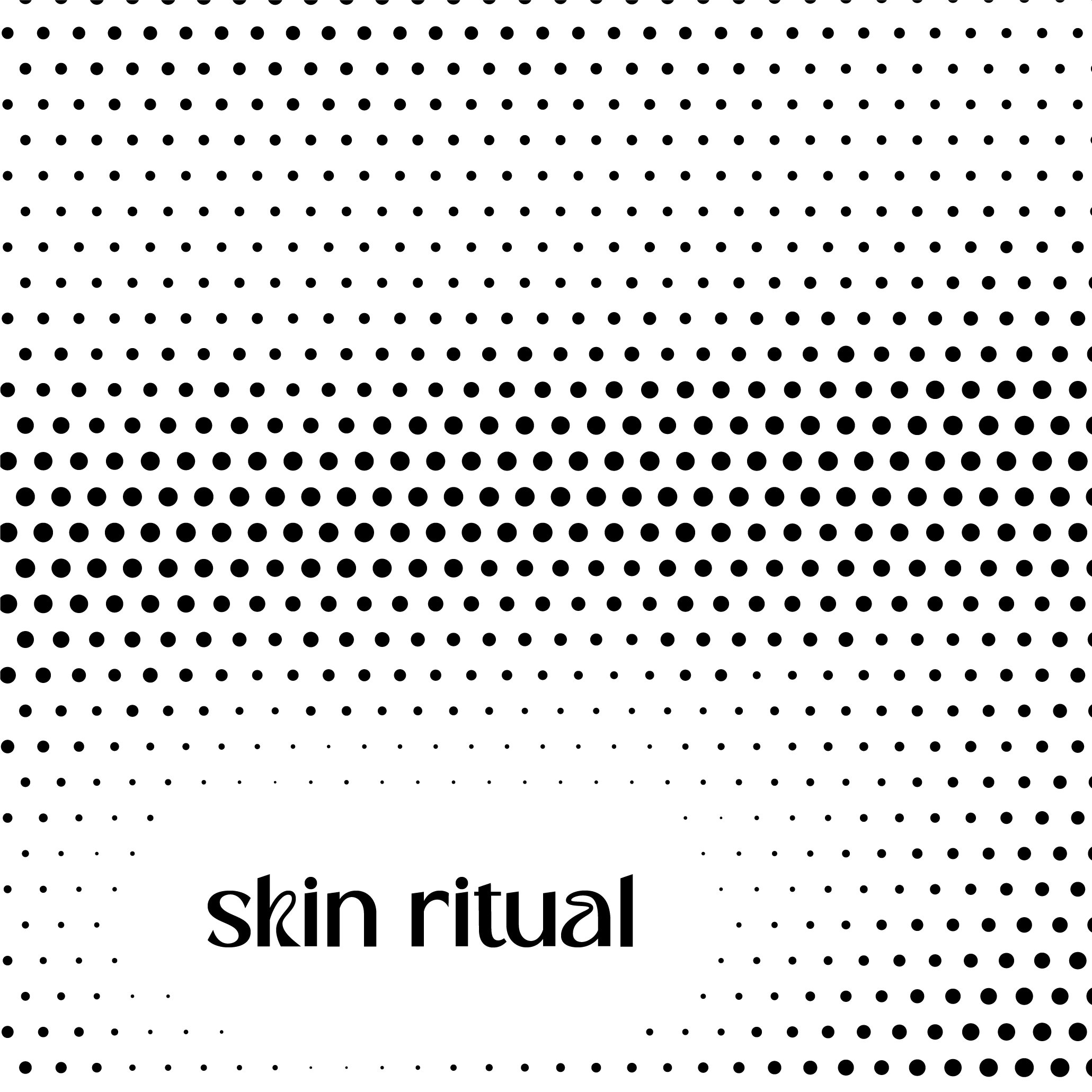

Logo & Supporting Assets
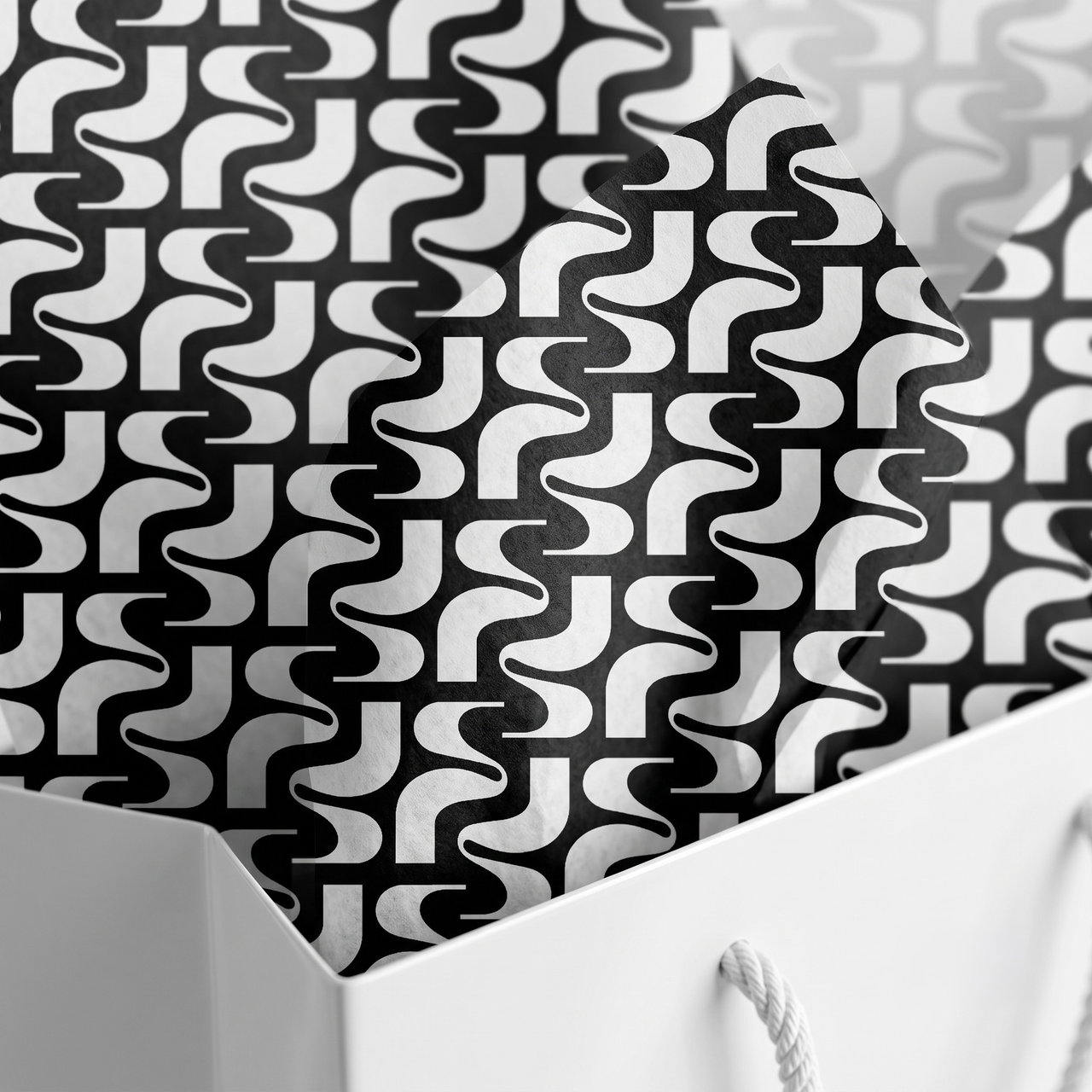
The final identity system was designed to be flexible, recognizable, and consistent across every brand touchpoint.
